A great design solution is just one part of the project process; delivering a thoughtful experience is what counts.
Being a student of the School of Industrial Design at Unitedworld Institute of Design has always provided me the leverage and extra scope that's needed beyond everyday academics. A design thinker, dreamer and a constant learner, design has always been about solving problems at its core. Seeing how small changes can lead to big solutions enthralls me the most.
I think that's where the key difference between engineering colleges and design schools lies. Design Schools broaden your scope beyond the everyday academic boundaries most other courses confine you in, it pushes you to face the real world right from small college projects upto freelancing and other outbound projects. One such opportunity, that broadened my horizon, was a branding project I did for NordicMojo. Initially completely unfamiliar with the work ethics and way of life in the Nordic countries, the project engulfed me in an immersive research and interesting discussions with the team at NordicMojo.

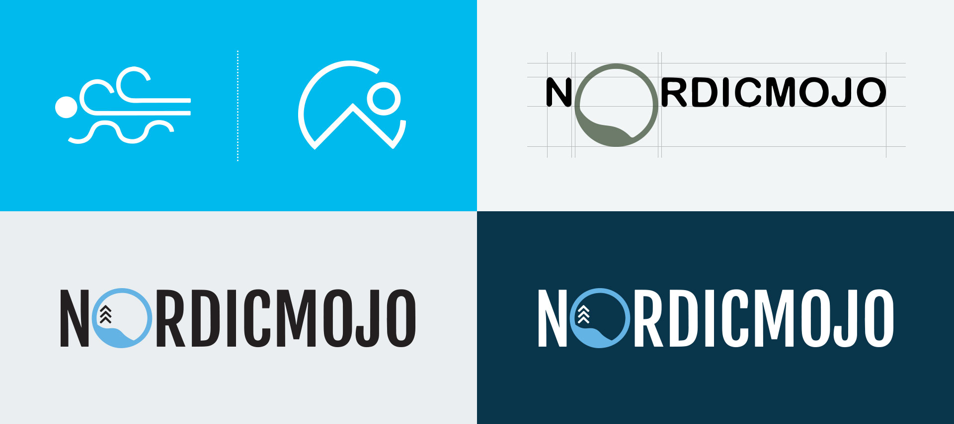
The major focus of the logo was to create an experience and feel that speaks volumes for itself and is a true reflection of the brand and the mutual bond that India and the Nordics have shared and is ever strengthening.
After multiple iterations, gritty brainstorming sessions, and a conducive colour palette, the logo brings out efficiently the essence of the brand. The process was highlighted by creating a moodboard and assigning values to everyday elements that would build up to be a part of the feeling the logo entices. The moodboard, a composition of images, was intended to evoke or project the concept of the brand.
Displaying an essential feature of the Nordic culture - "Lagom", meaning “Not too little. Not too much. Just right.” The logo encapsulates the socially democratic philosophy on life that everyone should have enough but not too much. The concept encourages an overarching balance across our lives: everything in moderation.
True to an avid sustainable lifestyle and culture ingrained in the thoughts of the Nordic people, the logo radiates a deep Sustainability language bringing out an eternal connectivity to the essence of life; water, nature, trees, and happiness. The yoga mantra built out of the resonance and rhythm generated through these things brings the holistic approach of life that every Nordic person treasures in his or her heart and art.
The branding encapsulates the essence of the culture and displays the Nordic values of working together to deliver sustainable solutions and address the greater societal changes. The branding reflects the company’s holistic and far reaching tonality, that aims to churn up the perfect recipe for a brighter tomorrow.
With the thorough research and vast knowledge that was brought to me through this project on a personal front, it also introduced me to the wide scale design driven thought that comprises these countries and is definitely somewhere any design student aspires to learn. This opportunity truly inspired me by the Nordic culture, its roots to the holistic approach of life and the just right philosophy motivating me to chart my future career goals through one of the top-ranking Nordic Design Schools.

Emil Løvgren, Per Arne Haug, and Alf Niklas Kalmár have joined NordicMojo AS as partners.;
I worked at one of the largest banks in the United States. Too-big-to-fail, marble-lobbied American finance. And at some point — with what I can only...;